Torque Magazine Redesign: Elevating User Experience, Performance, and SEO for an Enhanced Digital Journey
Project Overview
Torque is the industry-leading WordPress digital magazine that delivers news, how-to, marketing, and freelance business advice to the growing WordPress community. Launched in 2013 as a community give-back project from WP Engine, Torque’s design was outdated and confusing to use for both the people visiting, and the people maintaining the site. Additional pain points included high bounce rates, low return rates, stale content (at first glance), a busy design, lack of accessibility, tech debt, and limited WordPress Gutenberg support.

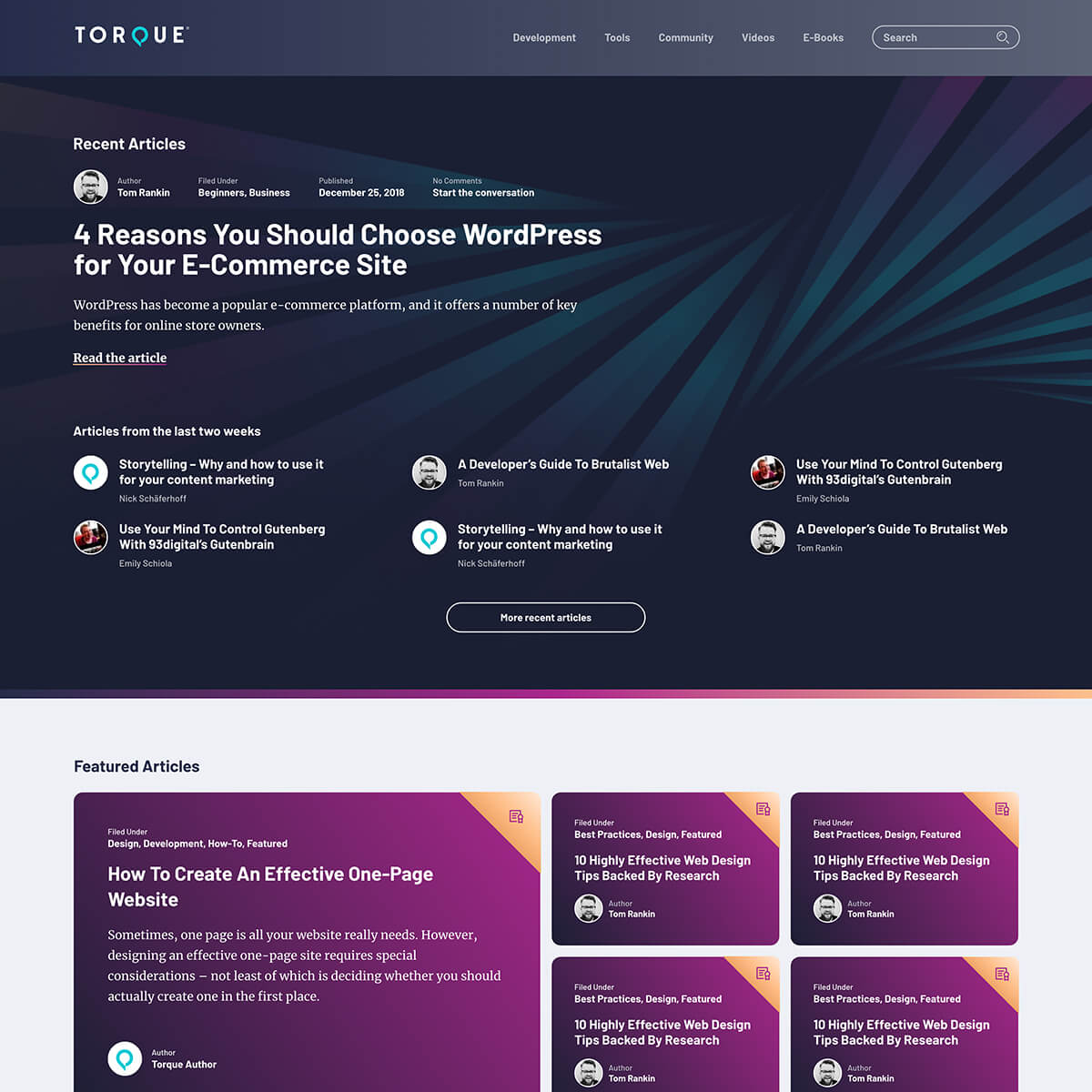
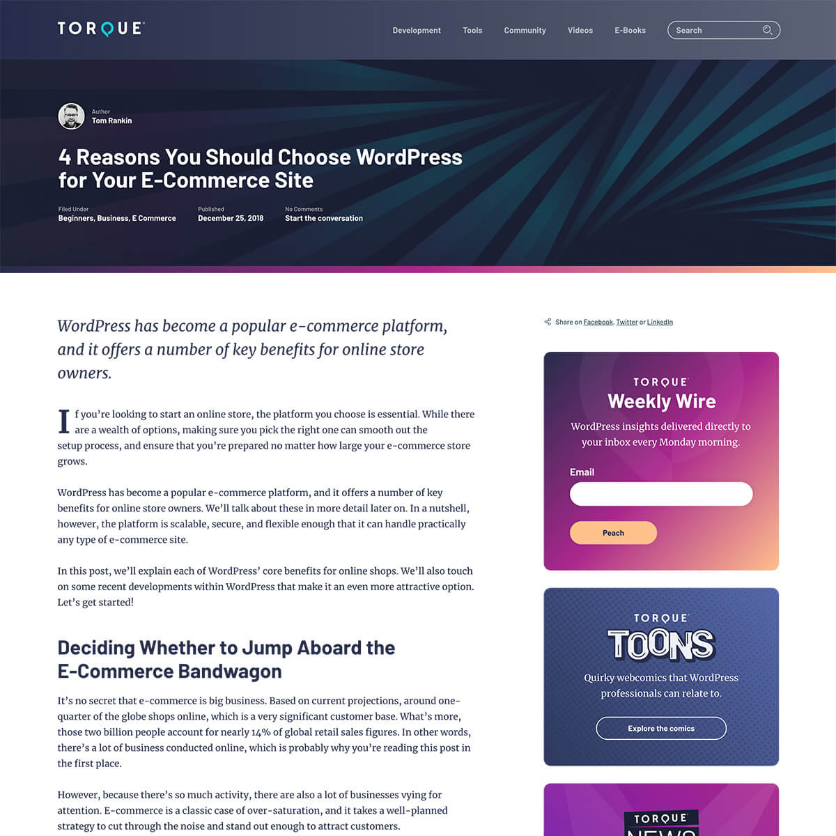
WP Engine’s Torque Magazine homepage before and after the redesign.
The mission was to redesign the site experience to delight developers and improve KPIs: increasing time on site, return visitor rates, and number of pages viewed per session, and decreasing the bounce rates. This redesign included a brand refresh and a complete redesign of the website, including the development of a new theme. I collaborated with the editorial, brand, and development teams at WP Engine to launch this project.
Planning & Ideation
My first task for Torque project was to gather data. I met with key stakeholders and decision-makers in order to gather business requirements, goals and KPI’s. I collected all of this data into a project charter, which I kept for reference throughout the project.
To better understand how visitors interacted with Torque, I studied site data from Google Analytics to uncover patterns in behavior, as well as understand top-performing content in terms of page views and bounce rates. I worked with stakeholders to develop and analyze the results of a user survey, which was emailed to our subscriber list. This helped us understand how users felt, holistically, about the experience of Torque as a brand.
Competitors and Titans
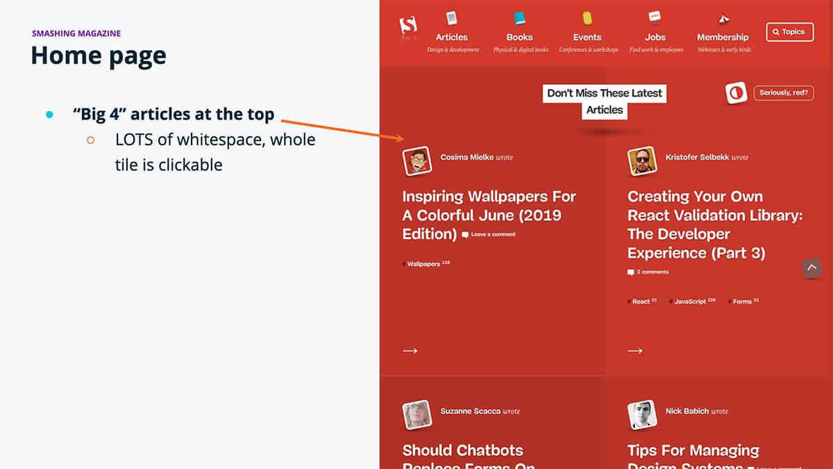
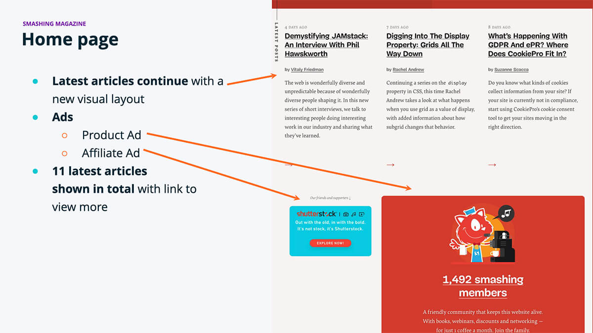
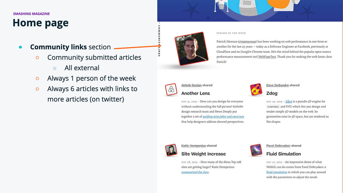
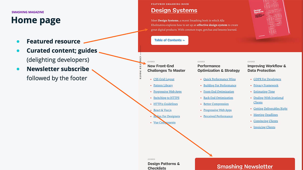
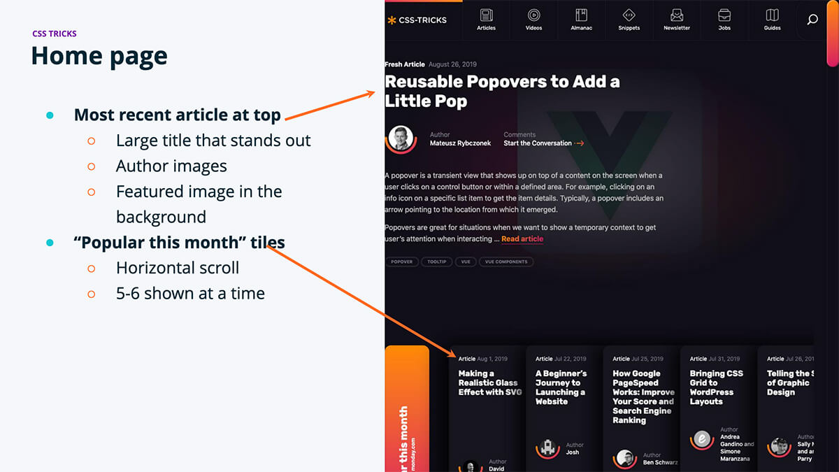
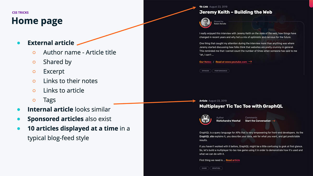
I researched Torque’s main competitors, WP Beginner and WP Explorer, in order to understand how they presented themselves and how we could differentiate ourselves in the same industry space. I next identified titans of the web design industry, Smashing Magazine, and CSS Tricks, to learn how they presented their content. The takeaways were that the titans focused on the content and the content creators. They were bold with their decisions, using color, large type, and whitespace to draw the eye into the content.
Torque competitor analysis.
Stakeholder Interviews
During this research phase, I was genuinely surprised to find that finding stock photography was the number one problem area for our editor; a grievance aired in passing through conversations about the editorial process. We realized that these images weren’t having a positive impact on any of our users: visitors were experiencing increased load times due to decorative (as opposed to informative) images on the page, and content creators had to search for the “perfect” stock photo for each article. Removing the images helped reduce the page load time, the publish and editorial time, and spending since stock photography was no longer needed.
Information Architecture
Upon using the administration panel of Torque, I discovered that Torque had 49 categories, of which 23 were duplicates or triplicates! To help sort this out, I created a content inventory spreadsheet using Google Sheets in order to understand what type of content Torque has, and to eliminate redundancies in categorization. This document was used to strategize batch reorganization efforts with the content team. Altogether, we eliminated 30 unnecessary categories, making the website easier to maintain by editors and easier to browse by visitors.


Torque category audit before and after.
At the end of the data-gathering process, I presented the findings to the primary stakeholders. This document also included data-informed solutions for business objectives. And with that, it was full steam ahead!
Wireframing and Concepts
Prior to design, I created wireframes for rapid iteration and feedback from stakeholders. This helped us focus on the goals of each page or section.
Torque early concept wireframe.
Brand Exploration
After wireframing, I began working on the brand. The first step I took in the design process was to refine the logo.

Torque logo before the redesign.
The logo’s color, Torque teal, was very similar to WP Engine teal, just a little less punchy. Having the entire logo set in that slightly desaturated teal also felt a bit tired.
The solution was simple – keep the letterforms the same but alter the colors slightly. Instead of Torque teal, WPE teal was used. And instead of the entire logo set in that color, a new darker denim blue color was added.
Setting the stylized Q in WPE teal adds the punch of color the logo needs and draws the eye into the most important, and most recognizable, part of the logo: the branded Q.
Torque logo after the redesign.
Once the logo was dialed in, the next task was to figure out the rest of the color palette. This process involved color exercises ranging from researching color trends to color picking to borrowing colors from the WP Engine palette.
One of my passions is accessibility. As I was running through the color exercises to find the right balance, I wanted to be sure that the colors we chose would be accessible when used together and with subtle neutrals. I tested each color in a variety of combinations to ensure it meets WCAG 2.1 AA contrast requirements.
Torque Color Palette
Denim
#252D4A
A11Y Over White: Fails
A11Y Over Denim: AAA
WPE Teal
#0ECAD4
A11Y Over White: Fails
A11Y Over Denim: AAA
Mulberry
#AA278C
A11Y Over White: AA
A11Y Over Denim: Fails
Heliotrope
#7A1BA6
A11Y Over White: AAA
A11Y Over Denim: Fails
Peach
#FFC08C
A11Y Over White: Fails
A11Y Over Denim: AAA
With the basic palette complete, we moved on to refreshing the brand of two regular Torque columns: Torque Toons and Torque News Drop (formerly Doc Pop’s News Drop).
Torque Toons
The original logo of Torque Toons, a WordPress and development-themed web-comic, was a potential trademark infringement. I worked closely with Brand Designer Eric but gave him the creative freedom to design what he thought best represented the column. In the kickoff, we agreed the logo should nod to those ‘toons from the golden age but left what that meant entirely up to him. What I really love about his work is the subtle nod to print cartoons with the halftone patterns in the background treatment. The logo provided a fresh and on-brand identity for this column.


Torque Toons logo before and after the redesign.
News Drop
The second logo we designed was one to replace the Doc Pop’s News Drop logo. With this logo, we wanted to rebrand the column and change the name to Torque News Drop. Since this column is video content, our brand designer used that as inspiration and created a logo that helps the visitor know what to expect when they arrive at that page. For the textures, we brainstormed and explored several background treatments before arriving at spotlights.


Torque News Drop logo before and after the redesign.
Web Design
One of our goals was to delight developers; nothing delights developers more than dark mode! However, we needed to launch the site in less than three months – a dark mode switcher would add considerable lift for the front-end developers. Keeping mindful of the time constraints and audiences, I chose to embrace the idea of dark mode for the home page while keeping the interior pages traditional.
Designing in Tandem with Development
During the design process, I created a token library and style guide for development and future design work. This design-thinking helped us keep patterns consistent throughout the site.
Torque design tokens for typography and forms.
One of the challenges of designing this site was that design and development were happening at the same time. This meant that I needed to keep everything organized. I used Adobe XD for the design, which allowed me to share all screens with developers–design tokens, atoms, components, pages, and prototypes–no matter the status. To reduce confusion, I knew that we would need a way to communicate when designs were approved for development. I did this by adding a status indicator along the top of each artboard. This helped the development team stay organized and was a change we adopted for future projects.


Design status indicators.
Sunsetting Stock Photography
One of the risks we took was the decision to remove featured images from the site. This meant that there would be no images on the home page or at the top of an article. We chose to do this based upon feedback we received in the initial stakeholder meetings. The biggest pain point of contributors and the Editor was sourcing images that felt on-brand. The team did not have the budget to produce their own imagery and, while stock imagery was an option, it added no value to Torque or our audience and only increased the amount of effort it took to publish an article. Knowing that Smashing Magazine had found success by focusing on the content, we made a bold decision to remove the images in order to streamline the editorial process and evolve the brand.
Web Development & QA
The development team did an amazing job with the time they were given to work on the site. With the recent acquisition of Studiopress and imminent launch of WordPress 5.0 with Gutenberg editor, one of the development goals of the site was to “drink our own champagne.” The end result being a site built using the Genesis framework and the Atomic Blocks plugin, which was created and released by WP Engine team members. Of course, way more effort went into the building of the theme than just the few sentences here. Big focus areas included site performance/speed, and accessibility. Preliminary data reported that the Application Performance score, a WP Engine site monitoring tool, improved from 0.75 to 1.0. Site speed also increased with the Time to Interactive report showing 7s average load time before the redesign, and 1.5s load time after! Other wins include SEO gains, and improved accessibility, cacheability, and error rates.

Quality Assurance
As development was nearing the finish line, I performed a QA audit of the work-in-progress site using Usersnap, which facilitated communication between design and development. This feedback helped us achieve parity with the designs that had been shown to the stakeholders so the launched site would meet stakeholder and user expectations.
Project Details
My Role
Information Architecture
User Experience Design
User Interface Design
Brand Design
Creative Direction
Project Type
Product Design
Team
WP Engine Digital Experience Team
Core Competencies
User Experience Design
User Interface Design
Prototype Design
Accessibility
Agile Methodology
Information Architecture
Wireframing
Conversion Rate Optimization
Skills
Adobe XD
Adobe Photoshop
Adobe Illustrator
Google Analytics
ScreamingFrog
JIRA & Confluence
Usersnap
WordPress
Project URL
https://www.torquemag.io
Copyright
WP Engine
Learnings & Takeaways
At the start of our project, Torque Magazine was averaging 3 million page views per year. By reorganizing articles, shifting the focus to the content, and removing unnecessary media, we were able to increase that metric by 66% and are expecting to break 5 million page views by the end of 2020.
Additionally, our Apdex score improved. Apdex is a measurement of the satisfaction of people who are using the website. Satisfaction is measured by a combination of how fast the site loads based upon a bench-mark that the site owner sets, and how many times the visitors encounter a server-side error.
Before the site launched, our Apdex score was as low as 64% and as high as 75%. After the site launched, our Apdex score increased to 100%. Upon investigation, it was discovered that the bench-mark had been set to a 1.5 second load time. We’ve since lowered it to 0.5s and the score remains above 90%.
Performance gains.
While the whole project was a huge learning experience, I especially loved working on creating an accessible brand for Torque. While there were changes along the way, having a cohesive color palette helped delight developers while remaining accessible to people who may have color deficiencies or low-contrast vision. This also opened up a broader conversation around accessibility at WP Engine and led to a brand palette update in 2020. 🎉
Testimonials
The redesign was a huge undertaking. Torque hadn’t undergone any kind of significant change since it was created in 2013. It was hard to find archived and downloadable content that was all still very useful and helpful. There was all this lovely evergreen content that you had to scroll to find.
Multiple teams of people were involved. I worked very closely with Stacey, who compiled ideas from the rest of the team, and then our amazing group of developers put it all into place.
It went through many iterations, and I am extremely happy with the way the website turned out. The team was able to include not only everything I wanted but things I didn’t know I wanted! I love the cards that direct people quickly to the Torque Toons and Videos, which were previously very hard to find.

